Colored Sapphire Engagement Ring: How Do I Pick the Right Shade of Blue?
A blue sapphire engagement ring can feel familiar and unexpected at the same time. It has the romance of a traditional engagement ring, but the color makes room for your own taste, story, and sense of style. The tricky part is that “blue” covers a whole lot of ground: icy sky, soft cornflower, inky midnight, vivid royal blue, and shades with a hint of teal.
After years of working alongside bridal ateliers and jewelers, I’ve learned that the best shade isn’t necessarily the rarest or most expensive one. It’s the one you love seeing on your hand, in the lighting you actually live in, set in a ring you’ll enjoy wearing. Here’s how to compare sapphire colors, choose a setting, and create a colored gemstone ring that feels personal rather than prescribed.
Start by letting go of the “right” engagement ring color
There’s no rule that an engagement ring has to be a white diamond. That tradition is relatively recent in the long history of engagement jewelry, and couples have always chosen rings based on what mattered to them: beauty, symbolism, family connections, practicality, or simply a stone they couldn’t stop thinking about.
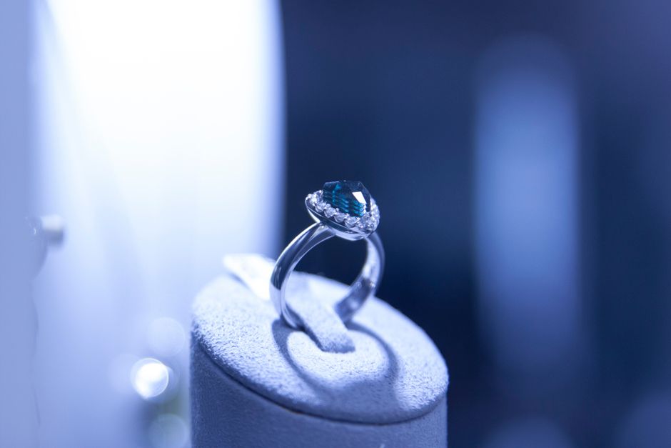
Choosing a sapphire can be a way to step outside the expected without giving up the meaning of an engagement ring. Maybe blue is your favorite color. Maybe it reminds you of the sea where you got engaged, a family heirloom, or the calm you feel with your partner. A colored gemstone ring can tell that story quietly—or make it the first thing everyone notices.
Before looking at stones, talk about budget. It doesn’t ruin the romance; it gives you a useful frame for shopping. Agree on a comfortable range, including the setting and any future resizing or maintenance. Then you can focus on what you love instead of feeling pressured by a number you never discussed.
How to compare blue sapphire shades
When jewelers discuss sapphire color grading, they’re generally looking at three related qualities: hue, tone, and saturation. These terms sound technical, but the ideas are simple. Hue is the basic color you see, tone is how light or dark it looks, and saturation is how vivid or muted the color appears.
Hue: the kind of blue
Look at whether you prefer a pure blue or a blue with a secondary color, such as violet or green. A violet-blue sapphire can feel soft and romantic; a teal-blue stone can feel more modern and a little unexpected. Neither is automatically better. Ask yourself which shade looks like something you’d choose in clothing, art, or home decor.
Tone: how light or dark
Lighter sapphires can feel airy and delicate, while darker stones often look dramatic and grounded. Very dark stones may appear nearly black in dim rooms, so check how the sapphire looks away from bright jewelry-store lights. If you’re drawn to a deep blue, make sure you can still see blue—not just a dark outline—under everyday lighting.
Saturation: how vivid
A highly saturated sapphire has a strong, lively color. A softer or more muted stone may have a gentler, vintage-inspired quality. Strong color can be striking, but a subtle shade may suit someone who wants their ring to blend easily with other jewelry. The point isn’t to Visit this link chase a grading label; it’s to understand what your eyes respond to.
Shade family Overall feel Try it if you like Check for Light or icy blue Fresh, delicate, bright Soft colors and understated jewelry Whether the stone still looks blue in lower light Cornflower blue Gentle, romantic, balanced A noticeable color without a very dark look How much violet or gray you see in person Royal or vivid blue Bold, luminous, classic with a twist Strong color and a statement-making center stone Whether the brightness feels right for everyday wear Midnight or inky blue Moody, dramatic, sleek Deep tones and a more understated sparkle That the stone doesn’t go too dark indoors Teal or blue-green Distinctive, organic, contemporary Earthy palettes and less traditional color Whether the green undertone is intentional for youUse the table as a starting point, not a grading chart. Sapphire color can look different in sunlight, warm indoor light, and cool office lighting. Ask to view the stone in more than one setting, and compare it beside your skin rather than relying on a photograph or a product listing alone.
Look at the actual stone, not just the description
Words like “cornflower,” “royal,” and “deep blue” can help you imagine a sapphire, but they aren’t a substitute for seeing it. Two stones with the same description can look quite different. Photos can also shift color because of lighting, screen settings, and editing.
If you’re shopping online, ask for clear videos or images in neutral lighting, plus information about treatments and the stone’s origin when available. A trustworthy seller should explain what they know and be candid about what they can’t verify. If answers about treatment or sourcing are vague, ask again before you buy. The provenance conversation is part of the purchase, not an awkward extra.
For an in-person appointment, bring a few photos of shades you like, but keep an open mind. Pinterest boards for ring inspiration are useful for spotting patterns—perhaps you keep saving teal stones or oval cuts—but they can also narrow your choices too soon. Use them to explain your taste, then judge the sapphire in person.
Choose a cut that supports the color
The cut affects how a sapphire reflects light and how its color reads. Oval and cushion cuts are popular because they show plenty of color and work beautifully in both modern and vintage-inspired settings. Round stones can look bright and balanced, while emerald cuts create a more architectural, step-like look.
Fancy shapes—such as pear, marquise, or kite-shaped stones—can make a blue sapphire ring feel especially individual. They can also change how the ring sits on your hand and how it pairs with a wedding band. Try the shape on your finger if you can. A stone that looks perfect in a close-up photo may feel too long, too wide, or simply not like you when worn.
Find a modern setting you’ll want to wear
The setting is more than a frame for the center stone. It affects the ring’s character, comfort, durability, and how easily it catches on sleeves. A few options to explore:
- Bezel setting: A rim of metal surrounds the stone, giving the ring a clean outline and helping protect the edges. It has a modern look and a smooth feel, though it may cover more of the sapphire’s edge.
- Low-profile setting: The stone sits closer to the finger, which can feel practical if you use your hands a lot. Check that the design still lets enough light reach the sapphire.
- Three-stone setting: Side stones can add contrast or symbolism, such as a sapphire paired with diamonds or other colored gems. Look at the ring from the side as well as from above.
- East-west setting: A long stone is set horizontally across the finger for a graphic, contemporary silhouette.
- Minimal solitaire: A simple band and one center stone keep attention on the sapphire’s color and shape.
One of my running notes is about settings that snag on knits. Prongs, sharp corners, and raised details can catch on sweaters, scarves, or hair, so run a fingertip around the ring and try it against a piece of fabric. And please check how the band feels between your fingers. A ring can look wonderful from above and still feel bulky when your fingers rest together.
Metal color matters, too. White metals can make blue appear crisp, while yellow gold can warm the overall look and create a pleasing contrast. Rose gold has a softer, romantic effect. Try the sapphire with the metal you plan to wear every day; don’t assume a metal will suit you just because it looks good in a styled photo.
Make it yours with bespoke design
A bespoke ring doesn’t have to mean inventing every detail from scratch. You might choose a sapphire from a jeweler’s selection, then customize its cut, setting, metal, band width, or accent stones. Or you may start with a sketch and work with a designer to bring it to life. The useful questions are practical as well as aesthetic: What is adjustable later? What is difficult to repair? How does the design protect the stone?
When comparing jewelers and design studios, ask about stone treatments, sourcing information, resizing, warranties, and repair options. Ask for a drawing or digital mock-up and confirm the band dimensions before approving the design. If you’re looking at retailers such as Lily Arkwright, compare the specific stone and setting details rather than choosing by brand name alone. For couples with different budgets or preferences, Modern Gents may be one option to explore alongside other retailers; check the materials and care information for the particular ring you’re considering.
For ideas beyond product pages, Bespoke Bride offers wedding-focused inspiration that can help you think about the ring as part of your broader style—not as a standalone decision. Keep a Pinterest board with examples of colors, settings, and outfits you actually wear, so your choices reflect your real life rather than one styled shoot.
Think about everyday wear and care
Sapphire is a durable gemstone, which makes it a popular choice for a ring worn often. But durable doesn’t mean indestructible. Hard knocks can still damage a stone or loosen its setting, and dirt can dull its appearance. Ask your jeweler for care instructions specific to the stone and setting, and arrange periodic checks for loose prongs or other wear.
Consider your routine before choosing a high setting or delicate details. If you work with your hands, play sports, or often wear gloves, a low profile and smooth edges may be more comfortable. You can also take the ring off for activities where it could be struck or caught. A good design respects how you live; it doesn’t ask you to change your habits to suit the jewelry.
A simple process for choosing your shade
- Set a comfortable budget. Include the stone, setting, and any likely adjustments or maintenance.
- Save inspiration with intention. Use Pinterest boards to spot recurring preferences, but keep a few alternatives in the mix.
- Choose a shade family. Decide whether you’re leaning light, vivid, deep, or teal before comparing individual stones.
- Compare in different lighting. Look for the color you’ll enjoy at home and outdoors, not only under showroom lights.
- Try the shape and setting on. Pay attention to height, snagging, and how the band feels between your fingers.
- Ask direct questions. Get clear information about treatments, origin, materials, resizing, and repairs.
- Take a breath. A thoughtful decision can still feel romantic. You don’t have to buy the first beautiful stone you see.
The shade you’ll love is the one that feels like you
Choosing a blue sapphire ring isn’t a test of whether you know the official name for every shade. It’s a chance to notice what draws you in, then find a stone and setting that fit your taste, hands, and everyday life. A pale sapphire may feel like an open sky; a saturated royal blue may feel joyful and bold; a dark teal stone may carry a memory that’s yours alone.
Once you’ve found the ring, the planning can keep that personal spirit. If you’re sharing a wedding invitation promotion, for example, a Google Sheet for RSVPs can help keep guest replies organized without adding another complicated system. The same principle applies to the ring: choose what works for you, ask clear questions, and make room for meaning that isn’t dictated by tradition.
There isn’t one perfect blue. There’s the blue you keep returning to—and the ring you’ll be glad to wear long after the proposal photos are posted.